
Hello and welcome to the series “Game’s too Easy?” Within, Metro will sarcastically discuss any number of assorted topics in an attempt to dispel myths and hearsay surrounding such. The focus of today’s discussion will be the graphical fidelity of World of Warcraft, with the main focus of dispelling the rumor that the graphics are poor and have remained poor since the start. We will also compare WoW’s graphical style to other games and discuss things in the bigger picture.
Before we begin, I would like to point out that I know little about the technical side of graphics, but I do know what my eyes and brain tell me. Apologies in advance if I use terms as a novice would. Also, I realize this doesn’t affect the game’s difficulty, but I feel it is a major complaint that people always bring up when discussing the game’s state so it will addressed the same way as other topics.
Since the game first came out in 2004, it’s been a common point to bring up the less than stunning graphics WoW contained. Surely in 2004 there wasn’t much to compare it to, but anyone with functioning eyes and neurons could understand the argument given some of the examples below.

Classic Orgrimmar.

Classic Ashenvale
What we see here is low quality and resolution textures, as well as odd shapes making up the majority of the structures. With this in mind, the first logical step would be to attempt to compare WoW’s engine to other video games. This seems fair… if done under certain circumstances!
The argument that always seems to surface when talking about games launching with little to zero end game content is as follows: “what do you expect, WoW is 10 years old, obviously it will have more content than a brand-new game.” Well if that statement is obvious to some, then the same statement should be logical when applied to graphics!
Now as I said, I don’t know much about how actual visual development works, but I’m sure running a video game based off graphics from ten years ago doesn’t help much. So while new games like Guild Wars and SWToR may appear to dominate in graphics, it’s important to keep things in perspective.
Carry on with the previous quote, and follow the trail it creates. If WoW has 10 years of content, but 10 year old graphics, and “New MMOx” has brand-new content and brand-new graphics, which would you prefer? Be honest with yourself, because it’s not uncommon to play a game simply because it looks pretty, but unfortunately the graphics only shimmer for so long, and then it comes down to what you are actually doing in the game. Perhaps it can be said that new games are spending too much time and resources on their graphics and not enough on their gameplay? That’s a topic for another installment though!
Let’s move on to the second major topic here, that being that WoW does nothing to compete or improve their graphical fidelity. This was a major topic in Wrath of the Lich King around the time Aion launched, and back then I would have agreed to some point with it, but every expansion since has leaped miles towards a better look and style.
The pictures below demonstrate the first major jump in my eyes: the redesign of the water in WoW. The pre-cata water looks absolutely dreadful, and looking back, it seems unfathomable to think that it was that way for so long. The new water, while not the most realistic or breathtaking water in any game, looks sooooo much more realistic and really makes me want to jump right in and splash about!

Pre-Cataclysm Water Graphics.
The next image is a side by side comparison of textures in general. On the left, we see the Temple of Ahn’qiraj, known as AQ40, as it was in 2004. Let’s not forget exactly what this way folks… This was a RAID instance, the highest pinnacle of development WoW produced at the time, and one that contained what most people would remember as the greatest world event in any MMO. The raid was a smashing success and contained a huge sprawling architecture that was meant to pre-date anything the player had seen before.
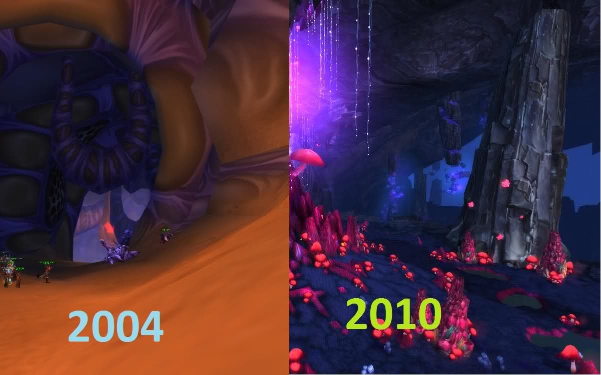
AQ40 : Deepholm
With all this effort put into a raid instance, I find it sickening to look at the floor and wall textures. The ground is meant to be sand, but you can barely tell that it’s anything more than a light brown paste covering some stone. The various inflections of color do add some flavor, but if they are removed you would literally have what resembles a smooth brown rug carpeted in the den of the most insidious creatures Blizzard has created. The walls don’t fare much better either! It’s hard to describe exactly what we are supposed to be seeing here, but at least the color and art scheme seems to fit the bug-filled instance more than the ground. The worst of it is the attempt to use shadow to create indentation, yet the resolution is so poor you can barely tell it’s even there unless you study closely.
Then we look to our right and see a chunk of the zone Deepholm. Once again, remember what we are looking at. This is NOT a raid instance; it is simply a questing area for people around level 82-83, one that most people skipped given the path of Cataclysm. We immediately see everything we didn’t see in the previous picture – detailed ground textures that make you actually feel like you are standing on mossy rock, and a pillar with real shadow quality and resolution to make it feel like it’s not just some smooth piece of pixels. On top of this, we see the crystal lights hanging from the top of the area, not seen in anything previous.
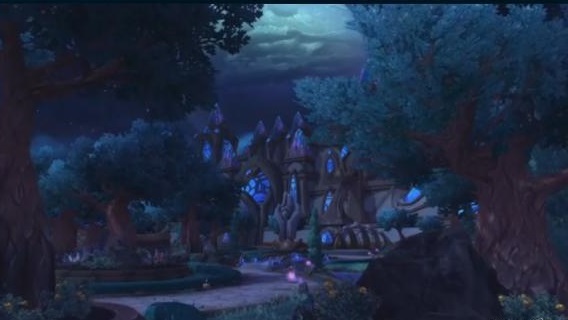
Next up, we can examine Mists of Pandaria and what it has brought to the game graphically. Below we see three images from the Jade Forest, the opening area of Mists of Pandaria. Without any question, this is the most graphically impressive and immersive zone in the video game for me, and I hope you agree as well. Even if all the other zones looked like AQ40, I would still call the expansion a success for being able to create such a beautiful image to help us find ourselves deep within the Pandaren culture. The theme especially is important, as it’s very unique from what we expected, yet not something new.
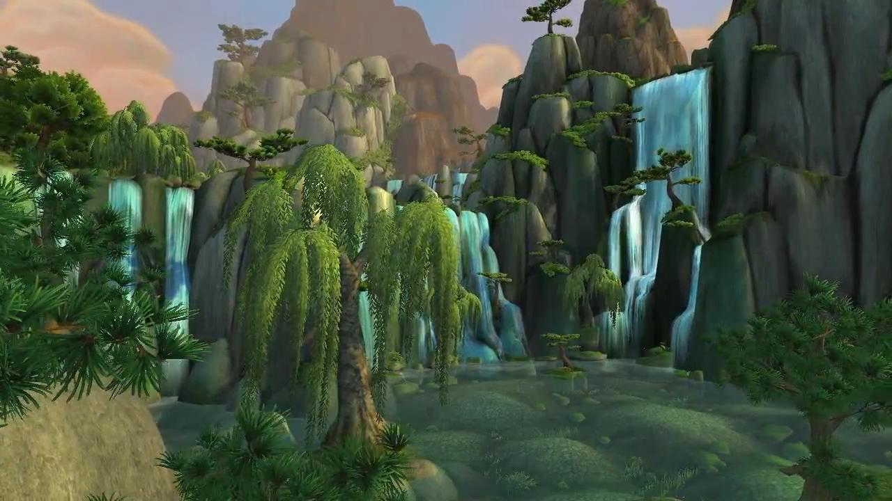
Jade Forest.

Jade Forest Architecture.
Most people wouldn’t make the connection, but think about the previous example of AQ40. It too is set in a land completely foreign to what we had seen so far, and should also be rich with idyllic structure and image. At the time, they incorporated obelisks and grand doorways, but when comparing the two, there is no mistake to be made. The art team has really shined here, and it’s obvious to me that visual aesthetics have raised to the top of Blizzard’s priority list.
While WoD is not yet even in beta, it is already clear to see that they are maintaining this dedication to improvement of graphical fidelity by the images below. One of the main features is the rework of character models, which some may look at as trivial, but I find to be confirmation of their intention. The artwork of the zones shown as well is as stunning as Jade Forest was, and despite a very different theme, I am confident in saying that this expansion will continue to improve on beautiful imagery. While the engine and scope of the graphics may still falter when compared to a game like Tera or Aion, the overall immersion and respect for the zones and raids continue to escalate with each content patch. No matter what, I find it undeniable to say that marked improvement is happening, and that we are finally looking at a complete game – with both breathtaking scenery, and the best end game content in the market!
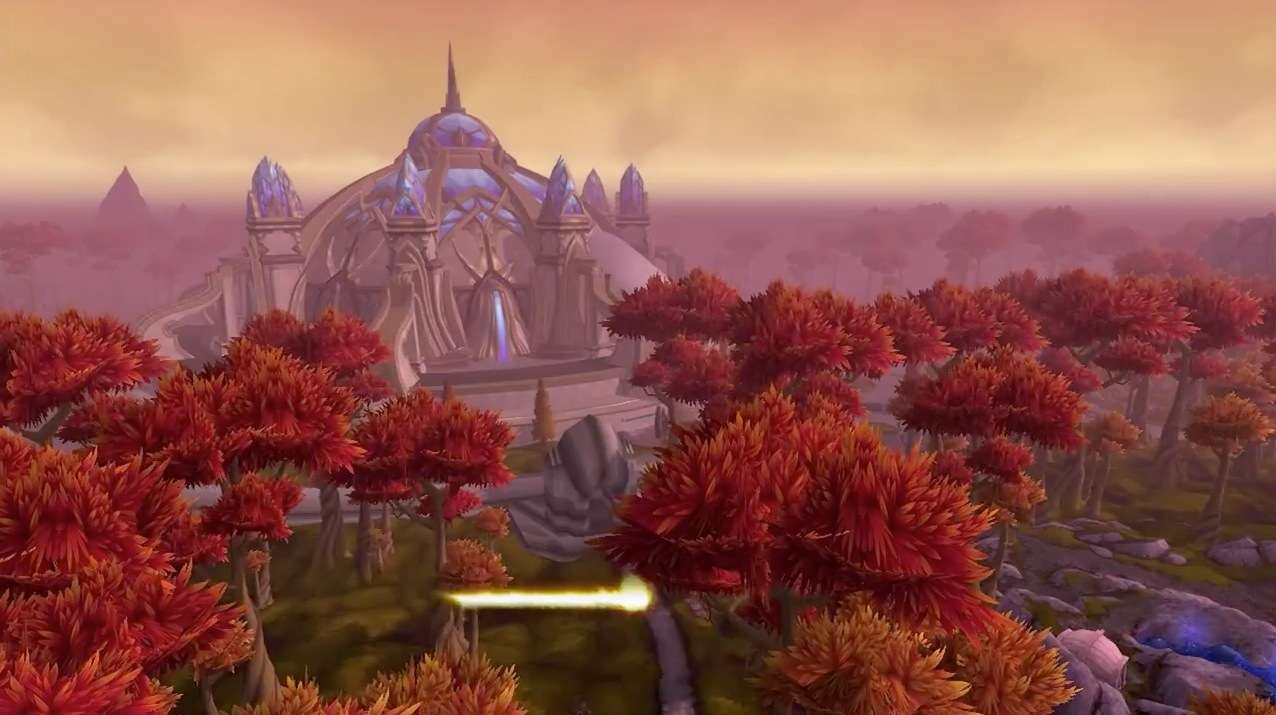
Another Zone Theme in WoD.
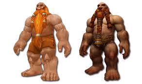
Character Model Updates.
One of the Zone Themes in WoD.
Thanks for reading! As always, we encourage comments and discussion here at Stratics, so if you have any thing you would like to add, it would be my pleasure to continue the conversation!
Recent Comments